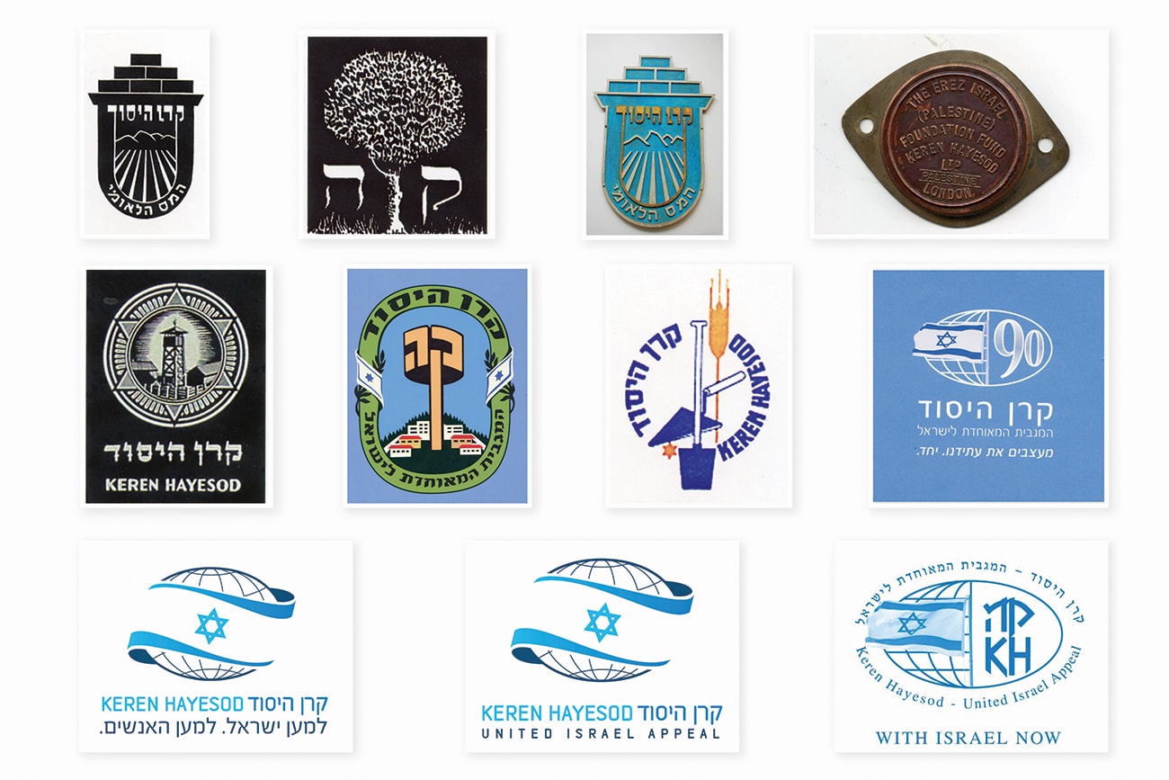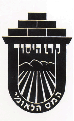
It is interesting to see how the Keren Hayesod logo has changed to suit the spirit of the times. Over the years, Keren Hayesod changed its logo a number of times, reflecting its development and renewal in different periods, in order to stay current and forward-looking. At the same time, several elements remain in all the logos. All have the two letters “K” and “H” – often on their own, but sometimes accompanied by drawings and illustrations. These drawings, which also appeared in various posters, stamps and publications, were usually related to building the country, ploughing fields, cultivating land, constructing houses, planting trees and so on. Over the years the icon of a globe was added, as well as the flag of the State of Israel. One thing has been preserved in the logos over the past 100 years: they all reflect the essential nature of Keren Hayesod and secure its position as the largest fundraising organization for the State of Israel and the Jewish people.
